HOME
BASEBALL
OTHER
FEEDBACK
RULES
RANKINGS
HISTORY
TEAMS
Teams with asterisks are not yet posted
Abbotsford Canucks
Adirondack Thunder
Allen Americans
Atlanta Gladiators
Bakersfield Condors
Belleville Senators
Birmingham Bulls
Bloomington Bison
Bridgeport Islanders
Calgary Wranglers
Charlotte Checkers
Chicago Wolves
Cincinnati Cyclones
Cleveland Monsters
Coachella Valley Firebirds
Colorado Eagles
Evansville Thunderbolts
Fayetteville Marksmen
Florida Everblades
Fort Wayne Komets
Grand Rapids Griffins
Greensboro Gargoyles
Greenville Swamp Rabbits
Hartford Wolf Pack
Henderson Silver Knights
Hershey Bears
Huntsville Havoc
Idaho Steelheads
Indy Fuel
Iowa Heartlanders
Iowa Wild
Jacksonville Icemen
Kalamazoo Wings
Kansas City Mavericks
Knoxville Ice Bears
Lehigh Valley Phantoms
Lions de Trois-Rivières
Macon Mayhem
Maine Mariners
Manitoba Moose
Milwaukee Admirals
Newfoundland Growlers
Norfolk Admirals
Ontario Reign
Orlando Solar Bears
Pensacola Ice Flyers
Peoria Rivermen
Providence Bruins
Quad City Storm
Rapid City Rush
Reading Royals
Roanoke Rail Yard Dawgs
Rochester Americans
Rocket de Laval
Rockford IceHogs
San Diego Gulls
San Jose Barracuda
Savannah Ghost Pirates
South Carolina Stingrays
Springfield Thunderbirds
Syracuse Crunch
Tahoe Knight Monsters
Texas Stars
Toledo Walleye
Toronto Marlies
Tucson Roadrunners
Tulsa Oilers
Utah Grizzlies
Utica Comets
Wheeling Nailers
Wichita Thunder
Wilkes-Barre/Scranton Penguins
Worcester Railers
| Bloomington Thunder | 49 |
Notice: All logos on this page are included within the parameters of 17 U.S.C. § 107, which states that the reproduction of a copyrighted work for purposes of criticism and/or comment is not an infringement of copyright. No challenge to the copyrights of these logos is intended by their inclusion here.
Posted 2025 January 26
You know how sometimes two cities grow together to the point that it becomes impossible to tell where one ends and the other begins? To the point where you might live on a residential street in one city but your next door neighbor lives in the other city, and the only indication of the border is that the pavement is a little different? Bloomington, Illinois is one of a pair of such cities, with its partner being a town called Normal. So if you wanted to make a bad joke, you could say that Bloomington is not Normal but isn't far from it.
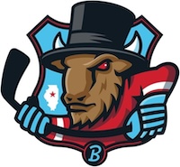
This logo, however, is quite unlike the city of Bloomington, because it's about as far from normal as it gets.
Before getting to the logo, however, I want to take a moment to talk about the name. This is Bloomington's fourth minor-league hockey team in the last twenty years (yeah, that's a pretty bad track record, I know), and this is the second time their name had had something to do with bison. It doesn't make a lot of sense. Bison were pushed out of the area over 150 years ago, and while a small population was recently introduced to a nature preserve in another part of the state, they're over 100 miles (160 km) away and there's only thirty of them. I'm not certain why bison seem to have such a hold on the imagination in Bloomington. But there you have it.
But whatever. However the team settled on the name, that's the name they settled on. Then it was time to come up with a logo, and they came up with...this.
Some of it makes sense. There's a bison in the logo because of course a team called the Bison would put a bison in its logo, and the bison is playing hockey because of course a hockey team named after an animal might think to have that animal playing hockey in the logo. But then things go off the rails. First, the hockey stick is curved. And I don't mean the blade is curved, which you would expect. No, the shaft of the stick is curved, which makes no sense. It's also, at most, a yard/meter long.
Then the designer decided to put a top hat on the bison. Why? Was the designer told to make the bison look classy somehow and this is all he could come up with? Is the designer a big Guns N' Roses fan? It's not exactly bizarre, but it's definitely odd.
At this point, the designer apparently took all leave of his senses and just started throwing random shit into the logo. Demonic red eyes? Sure, why not? A U.S. Highway sign in the background? Hell, yes! A map of Illinois with a star marking Bloomington? Too much is not enough, so in it goes! And then, just for good measure, the designer decided to put a lightning bolt on the bison's cheek. Hell, it doesn't make any less sense than half of the other things in the logo, right?
In short, this team has managed to come up with a logo so full of crazy shit that the arms are hardly even worth commenting on. But seriously, scroll up to the logo and look at those arms. Weird. But now look at the rest of the logo. Hardly worth commenting on.
So like I said: the city the team plays in is real close to Normal. But that logo isn't even in the same universe as normal.
Final Score: 49 points.
Penalties: Alliteration, 2 pts; Equip-Logo (quadruply-egregious), 25 pts;
Colorful, 13 pts; State, 4 pts; Yucky-Logo, 5 pts.
Bonuses: None.