HOME
HOCKEY
OTHER
RULES
RANKINGS
HISTORY
TEAMS
Teams with asterisks are not yet posted
Acereros del Norte
Águila de Veracruz
Aigles de Trois-Rivières
Akron RubberDucks
Albuquerque Isotopes
Algodoneros de Unión Laguna
Altoona Curve
Amarillo Sod Poodles
Arkansas Travelers
Asheville Tourists
Augusta GreenJackets
Beloit Sky Carp
Billings Mustangs*
Biloxi Shuckers
Binghamton Rumble Ponies
Birmingham Barons
Boise Hawks
Bowling Green Hot Rods
Bradenton Marauders
Bravos de León
Brooklyn Cyclones
Buffalo Bisons
Caliente de Durango
Capitales de Quebec
Cedar Rapids Kernels
Charleston Dirty Birds
Charleston RiverDogs
Charlotte Knights
Charros de Jalisco
Chattanooga Lookouts
Chesapeake Baysox
Chicago Dogs
Clearwater Threshers
Cleburne Railroaders*
Columbia Fireflies
Columbus Clippers
Columbus Clingstones
Conspiradores de Querétaro
Corpus Christi Hooks*
Dayton Dragons
Daytona Tortugas
Delmarva Shorebirds
Diablos Rojos del México
Dorados de Chihuahua
Down East Bird Dawgs
Dunedin Blue Jays
Durham Bulls
El Paso Chihuahuas
Erie SeaWolves
Eugene Emeralds
Evansville Otters
Everett AquaSox
Fargo-Moorhead RedHawks
Fayetteville Woodpeckers
Florence Y'Alls
Fort Myers Mighty Mussels
Fort Wayne TinCaps
Frederick Keys*
Fredericksburg Nationals
Fresno Grizzlies
Frisco RoughRiders
Gary SouthShore RailCats
Gastonia Ghost Peppers
Gateway Grizzlies
Glacier Range Riders
Great Falls Voyagers
Great Lakes Loons
Greensboro Grasshoppers
Greenville Drive
Guerreros de Oaxaca
Gwinnett Stripers
Hagerstown Flying Boxcars
Harrisburg Senators
Hartford Yard Goats
Hickory Crawdads
High Point Rockers
Hill City Howlers*
Hillsboro Hops
Hub City Spartanburgers
Hudson Valley Renegades
Idaho Falls Chukars*
Indianapolis Indians
Inland Empire 66ers of San
Bernardino
Iowa Cubs
Jacksonville Jumbo Shrimp
Jersey Shore BlueClaws
Joliet Slammers
Jupiter Hammerheads
Kane County Cougars
Kannapolis Cannon Ballers
Kansas City Monarchs
Knoxville Smokies
Lake County Captains*
Lake Country DockHounds
Lake Elsinore Storm*
Lake Erie Crushers
Lakeland Flying Tigers
Lancaster Stormers
Lansing Lugnuts
Las Vegas Aviators
Lehigh Valley IronPigs
Leones de Yucatán
Lexington Legends
Lincoln Saltdogs
Long Beach Coast
Long Island Ducks
Louisville Bats
Memphis Redbirds
Midland RockHounds
Milwaukee Milkmen
Mississippi Mud Monsters
Missoula Paddleheads
Modesto Roadsters
Montgomery Biscuits
Myrtle Beach Pelicans
Nashville Sounds
New England Knockouts
New Hampshire Fisher Cats
New Jersey Jackals
New York Boulders
Norfolk Tides
Northwest Arkansas Naturals
Oakland Ballers
Ogden Raptors
Oklahoma City Comets
Olmecas de Tabasco*
Omaha Storm Chasers
Ontario Tower Buzzers*
Ottawa Titans
Palm Beach Cardinals
Pensacola Blue Wahoos
Peoria Chiefs
Pericos de Puebla
Piratas de Campeche
Portland Sea Dogs
Quad City River Bandits
Rancho Cucamonga Quakes
Reading Fightin Phils
Reno Aces
Richmond Flying Squirrels*
Rieleros de Aguascalientes*
Rochester Red Wings
Rocket City Trash Pandas
Rome Emperors
Round Rock Express
Sacramento River Cats
Salem Ridge Yaks
Salt Lake Bees*
San Antonio Missions
San Jose Giants
Saraperos de Saltillo
Schaumburg Boomers
Scranton/Wilkes-Barre RailRiders
Sioux City Explorers
Sioux Falls Canaries
Somerset Patriots
South Bend Cubs
Southern Maryland Blue Crabs
Spokane Indians
Springfield Cardinals
St. Lucie Mets
St. Paul Saints*
Staten Island FerryHawks
Stockton Ports
Sugar Land Space Cowboys
Sultanes de Monterrey
Sussex County Miners
Syracuse Mets
Tacoma Rainiers
Tampa Tarpons
Tecolotes de los Dos Laredos
Tigres de Quintana Roo
Toledo Mud Hens
Toros de Tijuana
Tri-City Dust Devils
Tri-City ValleyCats
Tulsa Drillers
Vancouver Canadians
Visalia Rawhide
Washington Wild Things
West Michigan Whitecaps
Wichita Wind Surge
Wilmington Blue Rocks
Wilson Warbirds*
Windy City Thunderbolts*
Winnipeg Goldeyes
Winston-Salem Dash
Wisconsin Timber Rattlers
Worcester Red Sox
York Revolution
Yuba-Sutter Freebirds*
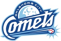
| Oklahoma City Comets | 59 |
Notice: All logos on this page are included within the parameters of 17 U.S.C. § 107, which states that the reproduction of a copyrighted work for purposes of criticism and/or comment is not an infringement of copyright. No challenge to the copyrights of these logos is intended by their inclusion here.
Posted 2025 April 10
There's a basic rule when it comes to teams putting comets into logo: there will be no evidence that the person who draws said comet has any idea what a comet actually is. For the record, comets are basically balls of various forms of ice: frozen carbon dioxide, frozen methane, frozen ammonia, frozen carbon monoxide, and frozen water. You wouldn't know that from comets in sports logos. Fort Wayne Komets? Apparently it's supposed to be a fireball (it looks more like a circular saw blade to me, but that's another matter). Utica Comets? The comet trail includes lightning. But the Oklahoma City Comets have taken it to a new level. The primary feature of their logo is the Moon.
To be fair, the logo doesn't imply the moon is a comet. There's another feature that may intended to be a comet which I'll get back to in a minute. But the biggest feature in the logo (other than the name) is clearly intended to be a moon. Why is there a moon in the logo? Did the logo designer think, "Well, the Moon is in space, and comets are in space, so they're the same thing!"? By that logic, you could pick any two things that are on earth and call them close enough. You could put a freaking sasquatch in the logo for a team named after a gem. You could put a rodent in the logo for a team named after commuters. You could put—
Wait. I've just cracked the code, haven't I? The Eugene Emeralds have Bigfoot in their logo. The Scranton Wilkes-Barre Railriders have a porcupine in theirs. The logo designers just picked some random thing on earth and said it was good enough. That also explains the Lancaster Stormers having a cow, the Kannapolis Cannon Ballers having a stuntman, and the Asheville Tourists having— no, wait. The Tourists also have the moon, which means using something in space as a logo for something on Earth. Yeah, I still don't get that one.
As I said a few paragraphs ago, there is another feature that may be intended to be a be a comet, and that's the baseball with the lines behind it. I have no doubt that if I asked the logo designer they would claim that was supposed to be the comet. But the problem is that it isn't. It's a baseball. And the "comet trail", were this a logo for a team with any name other than the Comets, would simply be lines indicating that the baseball is moving fast — particularly since comet tails typically get wider as they fall away from the comet, not narrower. Also, not to state the obvious, but comets don't include baseballs any more than they involve fire or lightning. So the designer can say that's the comet all they want; I'm not buying it.
And that leaves the Moon as the comet.
Which makes no sense.
But I guess it's really no worse than Sasquatch representing a gem.
Final Score: 59 points.
Penalties: Script, 7 pts; Equipment, 13 pts; Irrelevance, 39 pts.
Bonuses: None.