HOME
HOCKEY
OTHER
RULES
RANKINGS
HISTORY
TEAMS
Teams with asterisks are not yet posted
Acereros del Norte
Águila de Veracruz
Aigles de Trois-Rivières
Akron RubberDucks
Albuquerque Isotopes
Algodoneros de Unión Laguna
Altoona Curve
Amarillo Sod Poodles
Arkansas Travelers
Asheville Tourists
Augusta GreenJackets
Beloit Sky Carp
Billings Mustangs*
Biloxi Shuckers
Binghamton Rumble Ponies
Birmingham Barons
Boise Hawks
Bowling Green Hot Rods
Bradenton Marauders
Bravos de León
Brooklyn Cyclones
Buffalo Bisons
Caliente de Durango
Capitales de Quebec
Cedar Rapids Kernels
Charleston Dirty Birds
Charleston RiverDogs
Charlotte Knights
Charros de Jalisco
Chattanooga Lookouts
Chesapeake Baysox
Chicago Dogs
Clearwater Threshers
Cleburne Railroaders
Columbia Fireflies
Columbus Clippers
Columbus Clingstones
Conspiradores de Querétaro
Corpus Christi Hooks*
Dayton Dragons
Daytona Tortugas
Delmarva Shorebirds
Diablos Rojos del México
Dorados de Chihuahua
Down East Bird Dawgs
Dunedin Blue Jays
Durham Bulls
El Paso Chihuahuas
Erie SeaWolves
Eugene Emeralds
Evansville Otters
Everett AquaSox
Fargo-Moorhead RedHawks
Fayetteville Woodpeckers
Florence Y'Alls
Fort Myers Mighty Mussels
Fort Wayne TinCaps
Frederick Keys*
Fredericksburg Nationals
Fresno Grizzlies
Frisco RoughRiders
Gary SouthShore RailCats
Gastonia Ghost Peppers
Gateway Grizzlies
Glacier Range Riders
Great Falls Voyagers
Great Lakes Loons
Greensboro Grasshoppers
Greenville Drive
Guerreros de Oaxaca
Gwinnett Stripers
Hagerstown Flying Boxcars
Harrisburg Senators
Hartford Yard Goats
Hickory Crawdads
High Point Rockers
Hill City Howlers*
Hillsboro Hops
Hub City Spartanburgers
Hudson Valley Renegades
Idaho Falls Chukars*
Indianapolis Indians
Inland Empire 66ers of San
Bernardino
Iowa Cubs
Jacksonville Jumbo Shrimp
Jersey Shore BlueClaws
Joliet Slammers
Jupiter Hammerheads
Kane County Cougars
Kannapolis Cannon Ballers
Kansas City Monarchs
Knoxville Smokies
Lake County Captains*
Lake Country DockHounds
Lake Elsinore Storm*
Lake Erie Crushers
Lakeland Flying Tigers
Lancaster Stormers
Lansing Lugnuts
Las Vegas Aviators
Lehigh Valley IronPigs
Leones de Yucatán
Lexington Legends
Lincoln Saltdogs
Long Beach Coast
Long Island Ducks
Louisville Bats
Memphis Redbirds
Midland RockHounds
Milwaukee Milkmen
Mississippi Mud Monsters
Missoula Paddleheads
Modesto Roadsters
Montgomery Biscuits
Myrtle Beach Pelicans
Nashville Sounds
New England Knockouts
New Hampshire Fisher Cats
New Jersey Jackals
New York Boulders
Norfolk Tides
Northwest Arkansas Naturals
Oakland Ballers
Ogden Raptors
Oklahoma City Comets
Olmecas de Tabasco
Omaha Storm Chasers
Ontario Tower Buzzers*
Ottawa Titans
Palm Beach Cardinals
Pensacola Blue Wahoos
Peoria Chiefs
Pericos de Puebla
Piratas de Campeche
Portland Sea Dogs
Quad City River Bandits
Rancho Cucamonga Quakes
Reading Fightin Phils
Reno Aces
Richmond Flying Squirrels*
Rieleros de Aguascalientes*
Rochester Red Wings
Rocket City Trash Pandas
Rome Emperors
Round Rock Express
Sacramento River Cats
Salem Ridge Yaks
Salt Lake Bees
San Antonio Missions
San Jose Giants
Saraperos de Saltillo
Schaumburg Boomers
Scranton/Wilkes-Barre RailRiders
Sioux City Explorers
Sioux Falls Canaries
Somerset Patriots
South Bend Cubs
Southern Maryland Blue Crabs
Spokane Indians
Springfield Cardinals
St. Lucie Mets
St. Paul Saints*
Staten Island FerryHawks
Stockton Ports
Sugar Land Space Cowboys
Sultanes de Monterrey
Sussex County Miners
Syracuse Mets
Tacoma Rainiers
Tampa Tarpons
Tecolotes de los Dos Laredos
Tigres de Quintana Roo
Toledo Mud Hens
Toros de Tijuana
Tri-City Dust Devils
Tri-City ValleyCats
Tulsa Drillers
Vancouver Canadians
Visalia Rawhide
Washington Wild Things
West Michigan Whitecaps
Wichita Wind Surge
Wilmington Blue Rocks
Wilson Warbirds*
Windy City Thunderbolts*
Winnipeg Goldeyes
Winston-Salem Dash
Wisconsin Timber Rattlers
Worcester Red Sox
York Revolution
Yuba-Sutter Freebirds
| Bravos de León | 31 |
Notice: All logos on this page are included within the parameters of 17 U.S.C. § 107, which states that the reproduction of a copyrighted work for purposes of criticism and/or comment is not an infringement of copyright. No challenge to the copyrights of these logos is intended by their inclusion here.
Posted 2026 April 11
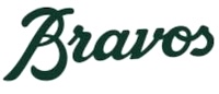
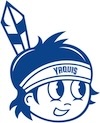
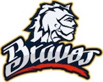 The previous logo for los Bravos de
León featured what appeared to be a member of the Guamare nation
wearing what appeared to be a hybrid between a traditional Guamare
headdress and a batter's helmet. Their new logo features just the team
name.
The previous logo for los Bravos de
León featured what appeared to be a member of the Guamare nation
wearing what appeared to be a hybrid between a traditional Guamare
headdress and a batter's helmet. Their new logo features just the team
name.
If this was an American team called the Braves (I'm sure you can figure out on your own that Bravos is simply Spanish for Braves), I'd assume it was an attempt to remove Native American imagery from the logo. And maybe it is here. I have no idea if there's a similar movement to do away with such imagery in Mexico. I will note that there's not a lot of such imagery in Mexican sports these days. The only professional teams in Mexico with names inspired by indigenous names are this team and los Olmecas de Tabasco in LMB, los Bravos de Juarez in Liga MX (soccer), and los Yaquis de Obregón in Liga Mexicana del Pacífico (minor league baseball). This team and los Olmecas just use wordmarks for logos, and los Bravos de Juarez use a horse. Only los Yaquis actually show an indigenous person in the logo. Is this because teams are going out of their way to avoid indigenous imagery, or just coincidence given that there are only four teams with indigenously-inspired names in the first place? Or is the fact that there are only four such teams itself evidence that teams are avoiding this sort of thing?
 Hell if I know. The closest thing
to a clue I have is that los Bravos de Juarez use a horse in their logo,
which definitely comes across as "We didn't want to just use a wordmark
but we also didn't want to offend anyone by putting indigenous imagery
in the logo". Then again, the Charlotte Checkers have a bear in their
logo and it's not because anyone finds board games to be offensive.
Hell if I know. The closest thing
to a clue I have is that los Bravos de Juarez use a horse in their logo,
which definitely comes across as "We didn't want to just use a wordmark
but we also didn't want to offend anyone by putting indigenous imagery
in the logo". Then again, the Charlotte Checkers have a bear in their
logo and it's not because anyone finds board games to be offensive.
Anyway, there's not a lot to say about the logo. Not only is it just a wordmark, but the wordmark is about as generic as it gets. It's another wordmark written in the same font you'll see used for junior high and high school teams across the U.S. Even if the team is trying to avoid indigenous imagery, I feel like it's got to be possible to use more interesting lettering. Heck, just use the wordmark from the old logo with the person removed.
But really, wordmarks are boring logos. If you're that worried about indigenous imagery, change your name. And if nobody in Mexico regards indigenous imagery as problematic, go ahead and use some indigenous imagery.
Final Score: 31 points.
Penalties: Script, 7 pts; Letter, 24 pts.
Bonuses: None.