HOME
HOCKEY
OTHER
RULES
RANKINGS
HISTORY
TEAMS
Teams with asterisks are not yet posted
Acereros del Norte
Águila de Veracruz
Aigles de Trois-Rivières
Akron RubberDucks
Albuquerque Isotopes
Algodoneros de Unión Laguna
Altoona Curve
Amarillo Sod Poodles
Arkansas Travelers
Asheville Tourists
Augusta GreenJackets
Beloit Sky Carp
Billings Mustangs*
Biloxi Shuckers
Binghamton Rumble Ponies
Birmingham Barons
Boise Hawks
Bowling Green Hot Rods
Bradenton Marauders
Bravos de León
Brooklyn Cyclones
Buffalo Bisons
Caliente de Durango
Capitales de Quebec
Cedar Rapids Kernels
Charleston Dirty Birds
Charleston RiverDogs
Charlotte Knights
Charros de Jalisco
Chattanooga Lookouts
Chesapeake Baysox
Chicago Dogs
Clearwater Threshers
Cleburne Railroaders*
Columbia Fireflies
Columbus Clippers
Columbus Clingstones
Conspiradores de Querétaro
Corpus Christi Hooks*
Dayton Dragons
Daytona Tortugas
Delmarva Shorebirds
Diablos Rojos del México
Dorados de Chihuahua
Down East Bird Dawgs
Dunedin Blue Jays
Durham Bulls
El Paso Chihuahuas
Erie SeaWolves
Eugene Emeralds
Evansville Otters
Everett AquaSox
Fargo-Moorhead RedHawks
Fayetteville Woodpeckers
Florence Y'Alls
Fort Myers Mighty Mussels
Fort Wayne TinCaps
Frederick Keys*
Fredericksburg Nationals
Fresno Grizzlies
Frisco RoughRiders
Gary SouthShore RailCats
Gastonia Ghost Peppers
Gateway Grizzlies
Glacier Range Riders
Great Falls Voyagers
Great Lakes Loons
Greensboro Grasshoppers
Greenville Drive
Guerreros de Oaxaca
Gwinnett Stripers
Hagerstown Flying Boxcars
Harrisburg Senators
Hartford Yard Goats
Hickory Crawdads
High Point Rockers
Hill City Howlers*
Hillsboro Hops
Hub City Spartanburgers
Hudson Valley Renegades
Idaho Falls Chukars*
Indianapolis Indians
Inland Empire 66ers of San
Bernardino
Iowa Cubs
Jacksonville Jumbo Shrimp
Jersey Shore BlueClaws
Joliet Slammers
Jupiter Hammerheads
Kane County Cougars
Kannapolis Cannon Ballers
Kansas City Monarchs
Knoxville Smokies
Lake County Captains*
Lake Country DockHounds
Lake Elsinore Storm*
Lake Erie Crushers
Lakeland Flying Tigers
Lancaster Stormers
Lansing Lugnuts
Las Vegas Aviators
Lehigh Valley IronPigs
Leones de Yucatán
Lexington Legends
Lincoln Saltdogs
Long Beach Coast
Long Island Ducks
Louisville Bats
Memphis Redbirds
Midland RockHounds
Milwaukee Milkmen
Mississippi Mud Monsters
Missoula Paddleheads
Modesto Roadsters
Montgomery Biscuits
Myrtle Beach Pelicans
Nashville Sounds
New England Knockouts
New Hampshire Fisher Cats
New Jersey Jackals
New York Boulders
Norfolk Tides
Northwest Arkansas Naturals
Oakland Ballers
Ogden Raptors
Oklahoma City Comets
Olmecas de Tabasco*
Omaha Storm Chasers
Ontario Tower Buzzers*
Ottawa Titans
Palm Beach Cardinals
Pensacola Blue Wahoos
Peoria Chiefs
Pericos de Puebla
Piratas de Campeche
Portland Sea Dogs
Quad City River Bandits
Rancho Cucamonga Quakes
Reading Fightin Phils
Reno Aces
Richmond Flying Squirrels*
Rieleros de Aguascalientes*
Rochester Red Wings
Rocket City Trash Pandas
Rome Emperors
Round Rock Express
Sacramento River Cats
Salem Ridge Yaks
Salt Lake Bees*
San Antonio Missions
San Jose Giants
Saraperos de Saltillo
Schaumburg Boomers
Scranton/Wilkes-Barre RailRiders
Sioux City Explorers
Sioux Falls Canaries
Somerset Patriots
South Bend Cubs
Southern Maryland Blue Crabs
Spokane Indians
Springfield Cardinals
St. Lucie Mets
St. Paul Saints*
Staten Island FerryHawks
Stockton Ports
Sugar Land Space Cowboys
Sultanes de Monterrey
Sussex County Miners
Syracuse Mets
Tacoma Rainiers
Tampa Tarpons
Tecolotes de los Dos Laredos
Tigres de Quintana Roo
Toledo Mud Hens
Toros de Tijuana
Tri-City Dust Devils
Tri-City ValleyCats
Tulsa Drillers
Vancouver Canadians
Visalia Rawhide
Washington Wild Things
West Michigan Whitecaps
Wichita Wind Surge
Wilmington Blue Rocks
Wilson Warbirds*
Windy City Thunderbolts*
Winnipeg Goldeyes
Winston-Salem Dash
Wisconsin Timber Rattlers
Worcester Red Sox
York Revolution
Yuba-Sutter Freebirds*
| Indianapolis Indians | 45 |
Notice: All logos on this page are included within the parameters of 17 U.S.C. § 107, which states that the reproduction of a copyrighted work for purposes of criticism and/or comment is not an infringement of copyright. No challenge to the copyrights of these logos is intended by their inclusion here.
Posted 2026 May 2
NOTE: This review incorporates text from the previous review for the Indianapolis Indians, which was posted 2011 April 9.
It's not hard to see why a team in Indianapolis might call itself the Indians. Indian is just the beginning of Indianapolis, after all. I'm glad that approach to naming teams hasn't spread very far. It could lead to come unfortunate names. Boston Bosses wouldn't be so bad. San Diego Sands isn't exactly intimidating, but at least it's relevant to the area. But I'm glad we don't live in a world where we have teams like the Kansas City Cans and the Baltimore Balls. And can you imagine a city like Philadelphia using that approach? That would be absolutely ridiculous. I can't imagine a worse name than if Philadelphia did something like this. Can you?
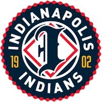
The Indianapolis Indians have a lot in common with the Spokane Indians, who play in the Northwest League. Both teams have been using the Indians name since the earliest days of the Twentieth Century (1902 in Indianapolis, 1903 in Spokane), before the major league team in Cleveland started using it. Both teams have partnered with Native nations in the general vicinity in order to make continued use of the name less problematic: The Spokane Indians with the Spokane Nation, and the Indianapolis Indians with the Miami Nation of Indians of Indiana. Both teams used to have logos featuring stereotypically-depicted Native Americans playing baseball and have moved away from that in recent decades. And now that the Indianapolis Indians have debuted this new logo, both teams have a logo which basically a letter in a circle with a single piece of Native American imagery. For the Spokane Indians, the one piece of Native imagery is the pair of feathers in the outer circle of the logo. For the Indianapolis Indians, it's the row of diamonds surrounding the logo, which are a reference to the ribbon work common among nations across the Midwest. Aside from that we get a blackletter I inside a diamond inside a circle, with the team name and year of founding around the circle.
You might say that's pretty generic. And it is. But given how controversial the name is these days, it's hard to blame them for going this route. In fact, all things considered it's probably the safest move that doesn't involve changing the name. I'm a little surprised the team didn't actually do that, seeing as how they were rebranding anyway and the MLB team in Cleveland getting rid of the same name creates a certain momentum in that direction. Maybe this team just likes riffing off the beginning of the city name. Okay, fine. Just don't give the major league team in Philly any ideas.
Final Score: 45 points.
Penalties: Alliteration (egregious), 11pts; Diamond, 16 pt; Letter,
24 pts.
Bonuses: Local, -6 pts.