
HOME
HOCKEY
OTHER
RULES
RANKINGS
HISTORY
TEAMS
Teams with asterisks are not yet posted
Acereros del Norte
Águila de Veracruz
Aigles de Trois-Rivières
Akron RubberDucks
Albuquerque Isotopes
Algodoneros de Unión Laguna
Altoona Curve
Amarillo Sod Poodles
Arkansas Travelers
Asheville Tourists
Augusta GreenJackets
Beloit Sky Carp
Billings Mustangs*
Biloxi Shuckers
Binghamton Rumble Ponies
Birmingham Barons
Boise Hawks
Bowling Green Hot Rods
Bradenton Marauders
Bravos de León
Brooklyn Cyclones
Buffalo Bisons
Caliente de Durango
Capitales de Quebec
Cedar Rapids Kernels
Charleston Dirty Birds
Charleston RiverDogs
Charlotte Knights
Charros de Jalisco
Chattanooga Lookouts
Chesapeake Baysox
Chicago Dogs
Clearwater Threshers
Cleburne Railroaders
Columbia Fireflies
Columbus Clippers
Columbus Clingstones
Conspiradores de Querétaro
Corpus Christi Hooks
Dayton Dragons
Daytona Tortugas
Delmarva Shorebirds
Diablos Rojos del México
Dorados de Chihuahua
Down East Bird Dawgs
Dunedin Blue Jays
Durham Bulls
El Paso Chihuahuas
Erie SeaWolves
Eugene Emeralds
Evansville Otters
Everett AquaSox
Fargo-Moorhead RedHawks
Fayetteville Woodpeckers
Florence Y'Alls
Fort Myers Mighty Mussels
Fort Wayne TinCaps
Frederick Keys*
Fredericksburg Nationals
Fresno Grizzlies
Frisco RoughRiders
Gary SouthShore RailCats
Gastonia Ghost Peppers
Gateway Grizzlies
Glacier Range Riders
Great Falls Voyagers
Great Lakes Loons
Greensboro Grasshoppers
Greenville Drive
Guerreros de Oaxaca
Gwinnett Stripers
Hagerstown Flying Boxcars
Harrisburg Senators
Hartford Yard Goats
Hickory Crawdads
High Point Rockers
Hill City Howlers*
Hillsboro Hops
Hub City Spartanburgers
Hudson Valley Renegades
Idaho Falls Chukars*
Indianapolis Indians
Inland Empire 66ers of San
Bernardino
Iowa Cubs
Jacksonville Jumbo Shrimp
Jersey Shore BlueClaws
Joliet Slammers
Jupiter Hammerheads
Kane County Cougars
Kannapolis Cannon Ballers
Kansas City Monarchs
Knoxville Smokies
Lake County Captains*
Lake Country DockHounds
Lake Elsinore Storm*
Lake Erie Crushers
Lakeland Flying Tigers
Lancaster Stormers
Lansing Lugnuts
Las Vegas Aviators
Lehigh Valley IronPigs
Leones de Yucatán
Lexington Legends
Lincoln Saltdogs
Long Beach Coast
Long Island Ducks
Louisville Bats
Memphis Redbirds
Midland RockHounds
Milwaukee Milkmen
Mississippi Mud Monsters
Missoula Paddleheads
Modesto Roadsters
Montgomery Biscuits
Myrtle Beach Pelicans
Nashville Sounds
New England Knockouts
New Hampshire Fisher Cats
New Jersey Jackals
New York Boulders
Norfolk Tides
Northwest Arkansas Naturals
Oakland Ballers
Ogden Raptors
Oklahoma City Comets
Olmecas de Tabasco
Omaha Storm Chasers
Ontario Tower Buzzers*
Ottawa Titans
Palm Beach Cardinals
Pensacola Blue Wahoos
Peoria Chiefs
Pericos de Puebla
Piratas de Campeche
Portland Sea Dogs
Quad City River Bandits
Rancho Cucamonga Quakes
Reading Fightin Phils
Reno Aces
Richmond Flying Squirrels*
Rieleros de Aguascalientes*
Rochester Red Wings
Rocket City Trash Pandas
Rome Emperors
Round Rock Express
Sacramento River Cats
Salem Ridge Yaks
Salt Lake Bees
San Antonio Missions
San Jose Giants
Saraperos de Saltillo
Schaumburg Boomers
Scranton/Wilkes-Barre RailRiders
Sioux City Explorers
Sioux Falls Canaries
Somerset Patriots
South Bend Cubs
Southern Maryland Blue Crabs
Spokane Indians
Springfield Cardinals
St. Lucie Mets
St. Paul Saints
Staten Island FerryHawks
Stockton Ports
Sugar Land Space Cowboys
Sultanes de Monterrey
Sussex County Miners
Syracuse Mets
Tacoma Rainiers
Tampa Tarpons
Tecolotes de los Dos Laredos
Tigres de Quintana Roo
Toledo Mud Hens
Toros de Tijuana
Tri-City Dust Devils
Tri-City ValleyCats
Tulsa Drillers
Vancouver Canadians
Visalia Rawhide
Washington Wild Things
West Michigan Whitecaps
Wichita Wind Surge
Wilmington Blue Rocks
Wilson Warbirds*
Windy City Thunderbolts*
Winnipeg Goldeyes
Winston-Salem Dash
Wisconsin Timber Rattlers
Worcester Red Sox
York Revolution
Yuba-Sutter Freebirds
| Corpus Christi Hooks | 35 |
Notice: All logos on this page are included within the parameters of 17 U.S.C. § 107, which states that the reproduction of a copyrighted work for purposes of criticism and/or comment is not an infringement of copyright. No challenge to the copyrights of these logos is intended by their inclusion here.
Posted 2026 June 5
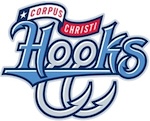
Note: This review incorporates the review for the previous Corpus Christi Hooks logo, which was posted 2014 May 11.
Am I the only one who thinks the name Corpus Christi Hooks is unnecessarily grim?
Okay, maybe I am. Let me just remind you: "Corpus Christi" is Latin for "body of Christ". The team is, in essence, named the "Hooks of the body of Christ".
Am I still the only one who thinks the name Corpus Christi Hooks is unnecessarily grim? I didn't think so.
I'm just relieved they didn't try to incorporate the city name into the logo the way the NHL's Buffalo Sabres do. That would be...awkward, to say the least.
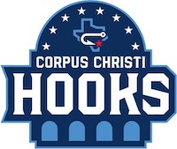
 The Hooks came up with a new logo
this year, which I assume was to bring them into compliance with the
Texas Excessive Pride Act of 1967, which requires that every fucking
team in Texas have a logo that screams, "Hey, y'all, we're from Texas!"
Not that the old logo didn't have some strong hints, what with the
banner at the top which included a white star on a blue background, a
white stripe, and a blue stripe. But since it only hinted at the
Texas flag rather than explicitly show it, it was probably deemed too
subtle
The Hooks came up with a new logo
this year, which I assume was to bring them into compliance with the
Texas Excessive Pride Act of 1967, which requires that every fucking
team in Texas have a logo that screams, "Hey, y'all, we're from Texas!"
Not that the old logo didn't have some strong hints, what with the
banner at the top which included a white star on a blue background, a
white stripe, and a blue stripe. But since it only hinted at the
Texas flag rather than explicitly show it, it was probably deemed too
subtle for most Texan legislators to understand to comply with
the text of the law. The new logo therefore gets rid of the banner and
adds an outline of the state of Texas. It also has a red star to
indicate where in Texas Corpus Christi is located. I could be wrong but
I predict there will soon be an update to change the color of the star
because Texan legislators will probably think the red star is a
communist symbol. But for now, the star is red.
You may be wondering about the overall shape of the logo. It is intended to represent the gazebos (known locally as "miradors" because apparently "gazebos" wasn't fancy enough) that can be found along the shore of Corpus Christi Bay. There's just one problem, which is that the miradors along Corpus Christi Bay don't actually look like the background shape. The miradors look like normal gazebos, with angled (not round) rooves and a cupola on top. The little light blue arches along the bottom of the logo represent the arches in the miradors, and those are at least accurate in shape, although the actual miradors have six rather than four.
I don't know about you, but to me they make the logo look like an elephant's leg.
The cap logo is just the outline of the state, the star, and the hook. In my opinion that would be a much better logo. You've got the hook to represent the team name, and the way it's on its side makes it work as a big C as well. You've got the state outline, which is completely stupid, but the logo does need something more than just the C.
And, of course, it keeps the logo compliant with Texas law.
Final Score: 35 points.
Penalties: Scenery, 11 pts; Letter, 24 pts.
Bonuses: None